A redesigned Emergency Room check-in experience using AI to provide better feedback and less waiting time for patients.
SKILLS/TOOLS
User Research (Generative and Evaluative Research); UX; UI (Sketch); Prototyping (Invision)
MY TEAM
Saloni Dandavate, Timo Grossman, Wenqiao Deng, and myself, with the guidance of Chris Risdon.
Research + Challenge
We interviewed different stakeholders (Including doctors, nurses, patients, and healthcare designers) to understand the system, its complexity, and challenges. Here are the key learnings we got from the research phase:
Patients receive
no (or not enough) feedback
Patients feel
like they are not
a priority
Most people should not be in an ER in the first place
Patients usually don’t get much information about what’s going on (how long will they wait, what will happen next, what should they do) and this can be very stressful.
The way the check-in experience is designed nowadays provides an environment perceived as cold, with not enough empathy and attention to patients.
Patients are classified in one of the five levels of acuity - 1 being immediate danger of death, and 5 being something that can be treated from home. Patients with acuity level 3, for example, can be experiencing a lot of pain, but are not as urgent as patients with levels 4 or 5, so they will have longer waiting times at the ER. It turns out that they should not be in an ER in the first place. A visit to an Urgent Care would be faster and cheaper.

how might we
create a more comforting ER check-in experience for patients and families through constant feedback at different steps in their journey?
Concept
Approach
We got very interested in the developments in machine learning for diagnosing patients. IBM’s Watson has already achieved remarkable success and the tendency is to keep evolving and becoming an even more powerful tool to help doctors and nurses.
Our approach is to use this type of technology to support the work of triage (done by nurses and doctors), but not to replace these professionals.
Ideation
To better understand the environment we were intervening, we used the Business Origami tool. With this, we were able to envision the whole experience we were designing, and not only focus on the UI of the AI agent.
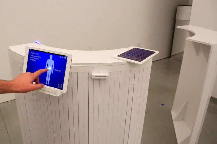
We decided to create a space with open counters in the place of the usual front desk, so the triage nurse can greet every new patient and decide if they are facing a life-threatening situation (and need to be seen by a doctor immediately) or if they should interact with Watson. The nurse can also easily navigate through the area and help any patient needing some kind of assistance.


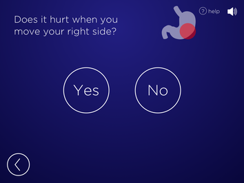
The Watson agent would ask questions to identify what’s happening and the level of urgency. With this information, it will show the patient the estimated waiting time (and also show the waiting time at an Urgent Care, if it decides that the ER is not the best option for this patient), and also provide the nurses and doctors its preliminary diagnosis, helping speed up the process for everyone involved.


PROTOTYPING
We created a prototype of Watson’s User Interface (considering three different scenarios/acuity levels) and conducted usability testings, where we identified some flaws in our original designs, such as the need to provide more clear affordances and signifiers, and to design clearer call-to-action screens.
We iterated the UI while we were building a physical prototype of the environment. The final usability testing was a great opportunity to demonstrate and observe the patients’ journey through the experience. We could also demonstrate how would the nurses interact with the patients at different levels (when first greeting and when the AI agent signalize - by a direct message to her device and by a visual light signal at the counter - the need for assistance)


