

To-Go is an app designed to make people's commute more productive by suggesting a task from the users' to-do list that fits perfectly for each commute time.
SKILLS/TOOLS
User Research (Generative Research); Branding (Illustrator); UX; UI (Sketch); Prototyping (Principle)
MY ROLE
I worked on this project with the guidance of my teacher Nathan Streu and the always helpful feedback from my colleagues from CCA.
Research + Challenge
According to studies, the average American commute is getting longer. Most of the people I interviewed for this project expressed that the 30 to 90-minute commute they experience is "time wasted".
"I feel like the time
spent commuting is
time being wasted."
This quote is from Harry, who is an undergraduate student that spends about one hour in the subway + bus on his way to school. Sometimes he spends this time reading, doing homework, listening to podcasts, or even doing some chore on his phone (i.e. replying emails or paying bills), and that makes him feel like that time was well-spent. He doesn't do it more often because he doesn't always know what to do or simply forget to try and find something productive to do on her way to campus.
How might we alter the
perception of commuting as
a waste of time, by turning it
into a more productive activity?

Photo: Raymond Francisco
Concept
The concept of the product is to combine the users' To-Do list (with readings/listenings and tasks that can be done during travels) with the available time (estimated time of commute), giving smart suggestions on how to make each commute productive.
The greater benefit of this product is to give people more free time, by using the unavoidable time spent commuting in a more productive way.


In order to start the development of the product, I focused on one use case, of a college student that goes to campus by public transportation.


BRANDING
Brand + Visual Design
With a clear definition of what problem this product was trying to solve, and how, I started defining how it should look and what personality it should take.


With the brand attributes defined, the name was created, mixing the concept of the to-do lists with the portability related to when and how the product will be used.
To-Go. Your to-do list, to go.
For the logo and visual identity, I sought inspiration in the classic Vignelli's NYC Subway Map.
The visual identity system created was anchored in the idea of connecting points, which is a reference to the visual representation of connecting places via transportation (mostly seen in subway maps design), as well as the way people interact with to-do lists (as bullet points waiting to be filled/checked).

Photo: Transit Maps


THE PRODUCT

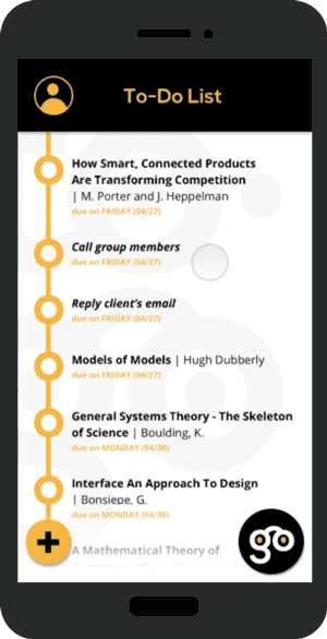
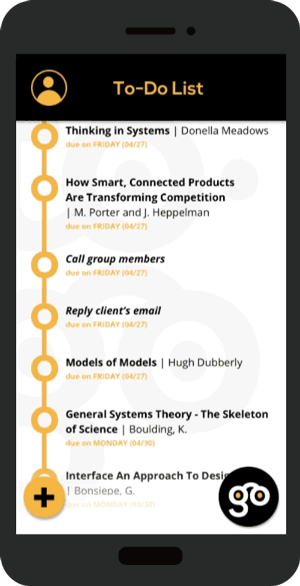
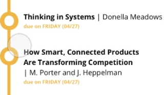
It all starts with the To-Do list, organized in chronological order (based on the due dates).

To add a new item to the list, the user needs to define if the item is a reading or a task.
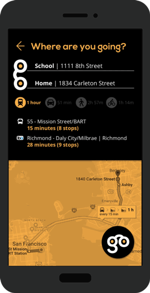
The main interaction happens when users tap the "Go" button, to start a trip. After setting the destination, users need to select the transportation mode. The app provides the itinerary and, if everything seems ok, users just tap the "Go" button once more.
The app now gives suggestions for tasks/readings that can be done during this next commute. Users can swipe to get new suggestions.

On this example, an article is suggested. Supposing that this article has an audio version, that option would be available within the environment of the To-Go app.

The app also offers the option to read in it, providing a focused reading experience (with no distractions, just the text and a progress bar at the top).
Details
UI Decisions
Open Sans was defined as the app's typeface. The typeface, designed by Steve Matteson, provides great legibility on screen and comes in a variety of styles, as well as combining well with Nexa, the brand's institutional typeface, used in the app for titles and headers.
The most important iterations happened in the list view and on the "add new" button. The design goal on this screen was to make easy for users to quickly scan through the list and identify priorities, due dates, and what tasks are done/to-do.

LIST VIEW:

1ST ITERATION
• Using different colors to indicate completion of a task.
• Lack of consistency with brand colors
• Not enough contrast (especially for people with color blindness)

FINAL DESIGN
• Use of typography and opacity to create focus and hierarchy
• Consistency with brand visuals
• Cleaner look
'ADD NEW' + 'GO' BUTTON:

1ST ITERATION

2ND ITERATION

FINAL DESIGN
• 'Add new' got simplified
• 'Add new' became more integrated with the list
• "Go" button becoming the predominant action button on the screen.
Motions
The animations play an important role in crafting the experience of using To-Go.

The logo animation reinforces the brand attributes and the connectivity aspect of it.
The logo animation reinforces the brand attributes and the connectivity aspect of it.
The motion for marking an item as 'done' represents one of the key interactions a user will have in the app. Not only it needs to clearly show that a change of status (from 'to-do' to 'done') has happened, but it also needs to provide the moment of joy related to checking things out of a list.

The "Go" button is also an important anchor to the brand and is the element that guides the main interaction of the product. The "Go" button transforms itself in size and position on the screen to show the flow users are navigating through.
Tablet
Trying to address the most use cases as possible, it was important to design the tablet version of the app.
• Shared visual system with the phone app;
• Divided screens, taking advantage of the larger screen + horizontal display;
• To-Do list visible most of the times;
• To-Do list can be hidden (by swiping left) on reading mode;


Style Guide
A basic Style Guide was created to make sure there is a visual consistency throughout the whole product (including within different touchpoints/devices) and that every possible situation is considered with a visual solution (especially considering the dynamic content of suggestions, for example). Below are some examples of the Style Guide:


Next Steps
On my last usability testing, I got some feedback that was helpful and will guide my next iteration.

- It wasn't clear for most testers that each item in the To-Do List is expandable, to provide more information about it. Possible solutions:
• design an affordance indicating that there's more to see on each item
• add on-boarding screens for first-time users, showing these 'hidden' features

- It wasn't clear for some users that there could be more than just one suggestion (users need to swipe to see al suggestions). The same possible solutions mentioned above seem to fit here as well.